Images
- Steven Lin
- Corrine Schoeb
This section covers adding images to your website. Swarthmore webpage are setup to allow editors to quickly and easily add a image at the top of any given webpage. This location is called the Primary Image and is the most common method for adding images to a webpage.,
Editors can also choose to add an image in the body copy region of the page. This option involves a few more steps, but it allows editors to add images at any location with the body copy block.
Images can also be added through one of the many components available to editors. This is covered in the Components section.
A website homepage’s also offers some additional options that include allowing editors the ability to include two images or a large full-span image.
NOTE: All images added to the website MUST include ALT text.
Alt Text is a written description of an image. This description is what appears when an image is not available. It is essential for those with low bandwidth, those who have images turned of, and those who use assistive technologies such as screen readers.
WCAG’s Alt Decision Tree is a useful tool when deciding whether to add an image. It is important to think about how it relates to the content of the page. If you decide it is related to the content or enhances understanding of the content the add the image. Describing an image is a bit of an art form. A quick way to start the process is to imagine you are speaking to a friend on the phone, describe the image so they can understand its meaning and why it is there. Take a look at Alt Text as Poetry for some practice and great ideas of how to create meaningful alt text.
NOTE: Image Editing
Drupal does not have any built-in image editing capabilities. Any image related work such as: cropping, resizing, color-correcting, and saving images in the proper format, needs be done in your preferred photo editing software such as Adobe Photoshop or one of the free online photo editors such as Canva or Pixlr.
6.1) Adding a Primary Image
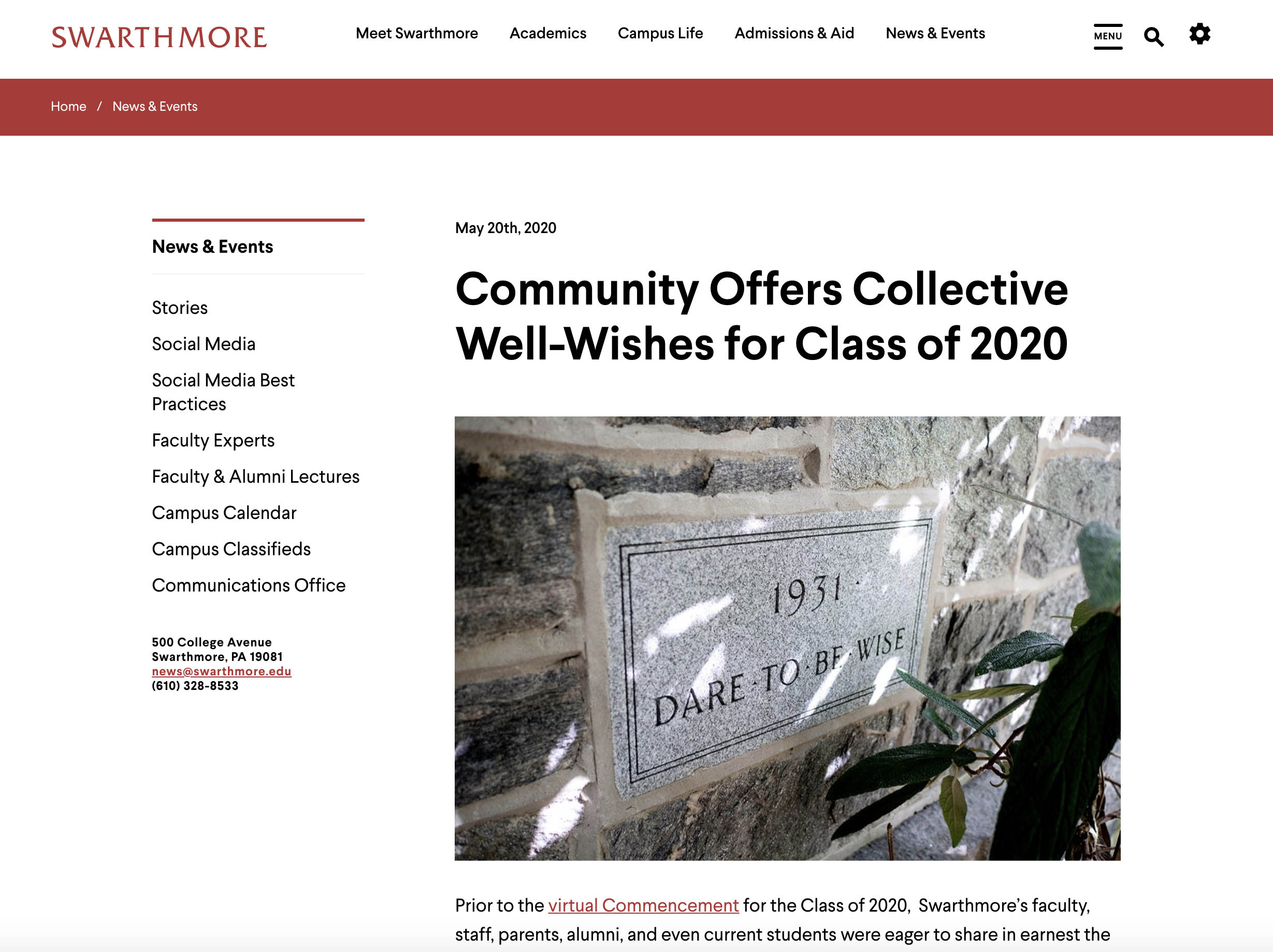
The Primary Image that is located below Title/Subtitle and above Body block. This is where editors add images at the top of the webpage.
Click the Insert an Image button to begin. A new window will appear called “Insert an Image”.

In the Insert an Image window (see below), you can select Upload Image to upload a new image into Drupal or choose Select Image if you wish to use an image that has been previously uploaded into the website’s image folder.
Select the appropriate image from the list using the radio button to the left.
Then click the Select Image button located in the lower left corner.

A thumbnail will now appear in the Preview. Whenever you add an image to a webpage, you MUST INCLUDE alternative text.
Learn more about alternate text.In the Image Alignment drop down You can choose the image alignment as either Centered Above Content or Floating Right.
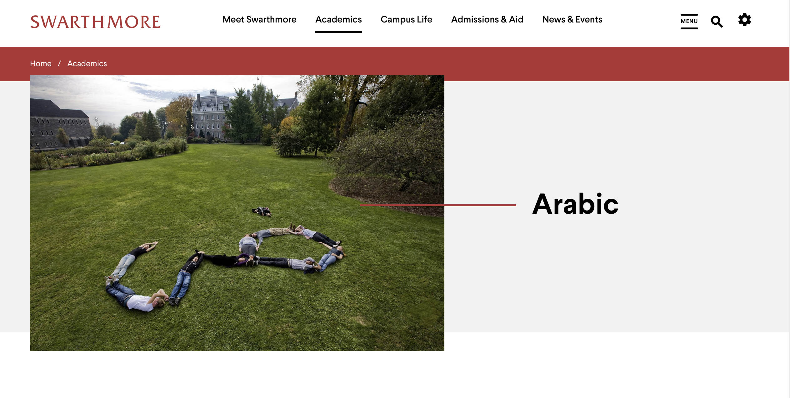
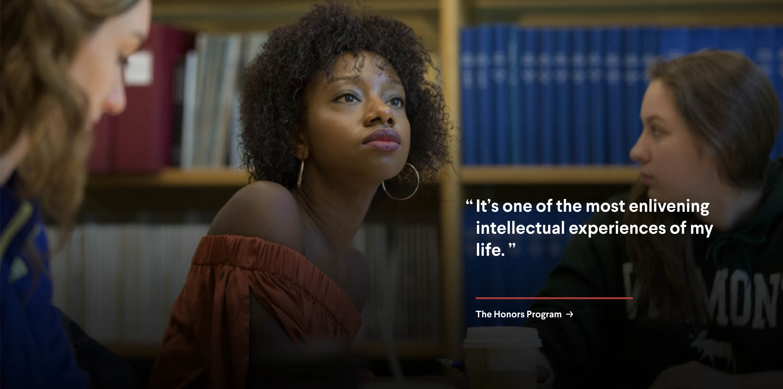
Centered Above Content - is for large landscape images. It will display the image followed by the text which will always appear below the image.
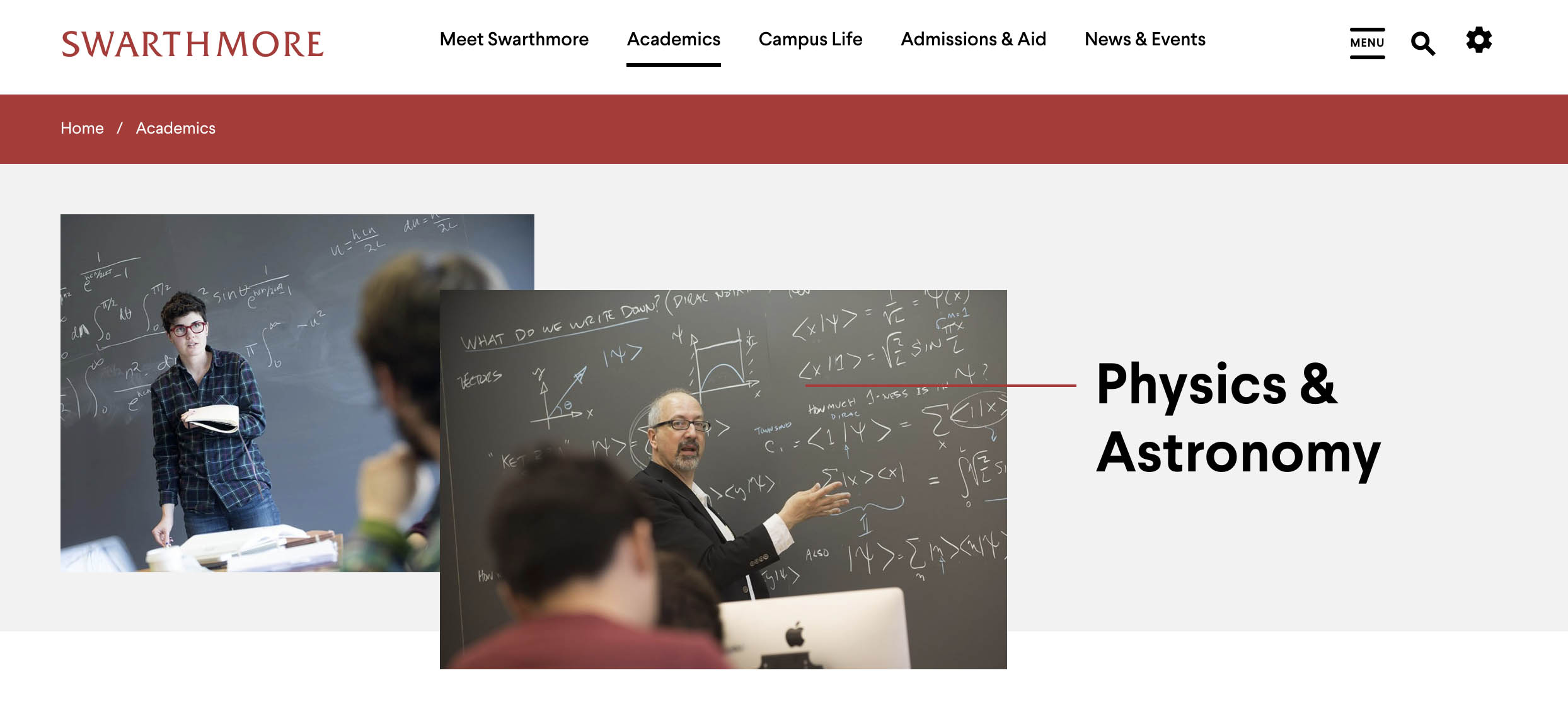
Floating Right - is often used for portrait/vertical images as well as smaller images. It will display the image to the right and the text in the Body block will wrap around the image. If the original image used is large landscape image, Drupal will automatically size it down 50% and wrap the text around it.
Centered Above Content
Floating Right
Add an optional image caption to provide further context about the image to readers.
6.2) Adding an Image in the Body Copy
You can also choose to add images directly in the body copy rather than using the primary image located at the top of the page template. This process involves more steps, but allows you to position images closer next to the content that references it.
Put your cursor where you want the image to appear in the body copy
Click the Add Image using image browser button
In the Insert an Image window (see below), you can select Upload Image to upload a new image into Drupal or choose Select Image if you wish to use an image that has been previously uploaded into the website’s image folder.
Select the appropriate image from the list using the radio button to the left.
Then click the Select Image button located in the lower left corner.
The image will now appear in the body copy
Use the function bar at the top to manage the image properties (see more below)
The Insert image in body copy function bar has several abilities:
Manage Alt Text / Decorative Image - This menu item allows you to add alternate text to the image. All images require alt text in order meet Swarthmore’s accessibility standards. Alt text is a description of what is happening in the image. You can also indicate if the image is purely decorative. Decorative images don’t add information to the content of a page. For example, the information provided by the image might already be given using adjacent text, or the image might be included to make the website more visually attractive.
Toggle Caption On/Off - Toggles the image caption field to appear or disappear so that you can include a caption to provide context of the image to the reader.
Image Link - allows you make the image a link. Learn more about how links work.
Standard Image Alignment Caption - allows you to manage the standard alignment options for captions. These include:
Caption Below - the image will remain full size and centered. The caption will appear below.
Caption Right - the image will remain full size and floated left. The caption will appear to the right.
Image Floated Left Caption Below - the image will be reduced 50% and floated left. The caption will appear below. The body copy will wrap around both image and caption.
Image Floated Right Caption Below - the image will be reduced 50% and floated right. The caption will appear below. The body copy will wrap around both image and caption.
Gray Image Background Captions - creates a gray background around the image and caption.
Note: the gray image background captions is an older style no longer in active use. It is recommended that you use the standard caption styles listed above.
Gray image background / Image Centered - the image will remain full size and centered. The caption will appear below.
Gray image background / Image Floated Left Caption Below - the image will be reduced 50% and floated left. The caption will appear below. The body copy will wrap around both image and caption.
Gray image background / Image Floated Right Caption Below - the image will be reduced 50% and floated right. The caption will appear below. The body copy will wrap around both image and caption.
Clear Styles - this will clear any caption styles and return it to image centered, no caption.
6.3) Homepage Images
The homepage is unique in that it allows editors some additional header image layout options. These include:
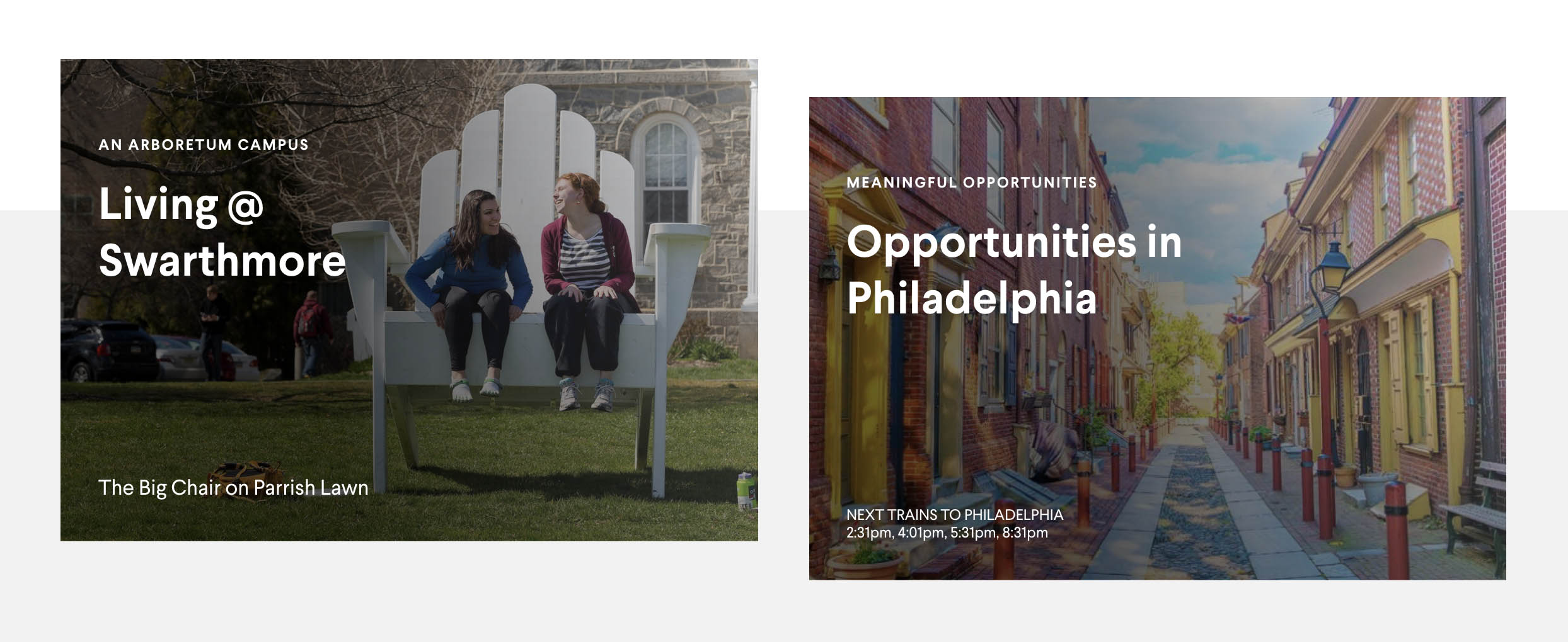
One or Two Images aligned left - you can include either a single image or two images (one stacked on top of the other) aligned left of the website title
One or Two Images aligned right - you can include either a single image or two images (one stacked on top of the other) aligned right of the website title
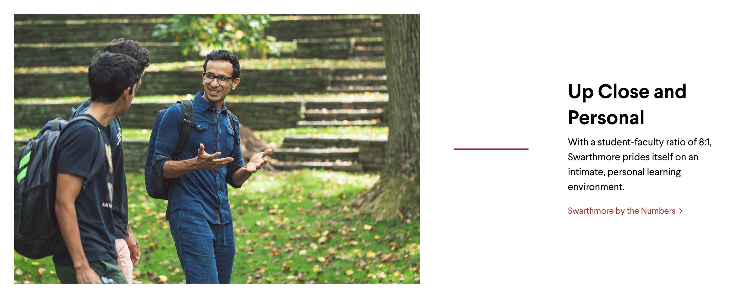
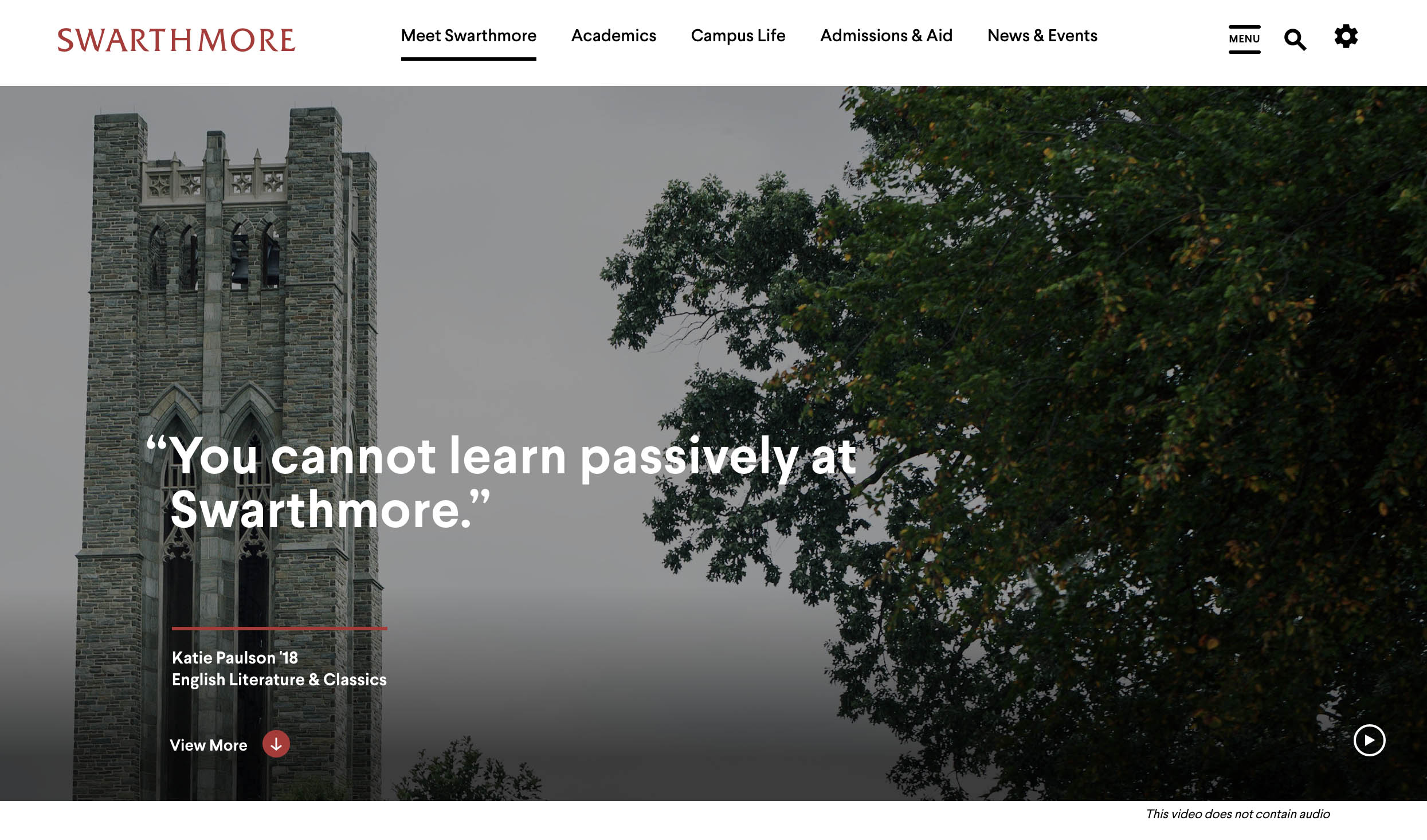
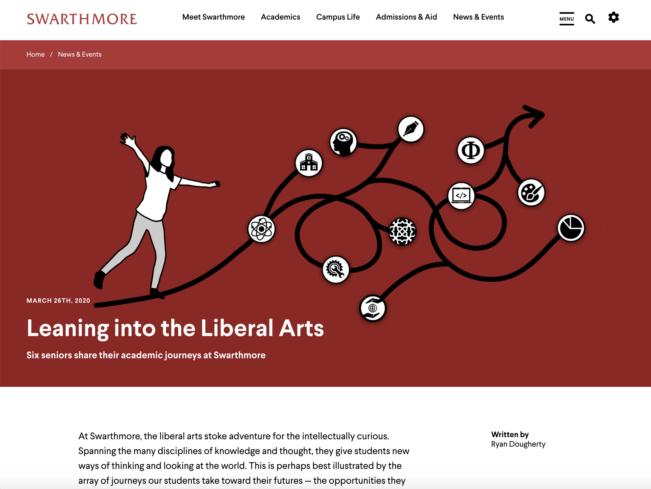
Full-Span Image - a single full image that spans the full width of the page. The page title is overlaid on top of the image in the lower left corner.
Examples:
One Images Aligned Left
Two Images Aligned Right
Full-Span Image
The homepage header layout of the homepage managed by editing the homepage.
A drop down that lets you select layout
This toggle will add a slightly opaque filter on top of the Full Span Image (only) that improves legibility of the Page title which is overlaid on top of the image in the lower left corner.
Allows you add a new (or second) image to the header area
Displays the current image, alt text. Allows you to replace the existing image or remove it
When updating the image, you can save the page in DRAFT or PUBLISHED mode
Click Save to commit your changes or Cancel to stop.
6.3) Recommended Image Sizes
The following image style guide shows you the recommended image sizes that should be used for all pages and components.
Recommended Sizes for Header Images
Image Type | Retina (WxH) | Standard (WxH) | Preferred Ratio | Preferred Orientation |
|---|---|---|---|---|
1756 x 1170 | 878 x 585 | 3:2, 16:9 | landscape | |
1056 x 704 | 528 x 352 | 3:2, 16:9 | landscape | |
880 x 662 | 440 x 331 | 3:2, 16:9 | landscape | |
3500 x 1360 | 1750 x 680 | custom | landscape | |
1524 x 940 | 762 x 470 | 3:2, 16:9 | landscape |
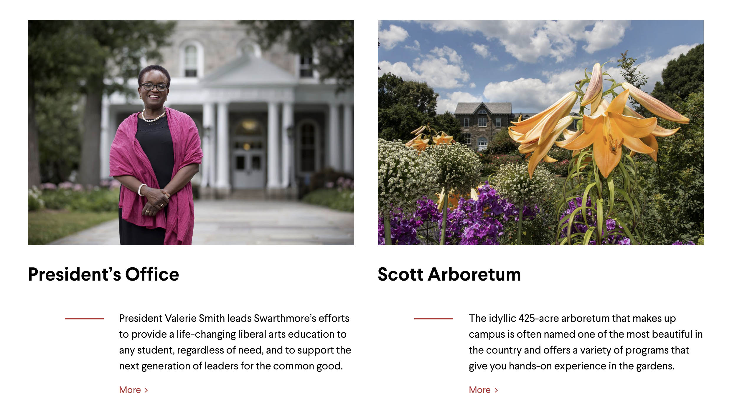
Recommended Sizes for Panes
Image Type | Retina (WxH) | Standard (WxH) | Preferred Ratio | Preferred Orientation |
|---|---|---|---|---|
1530 x 1046 | 765 x 523 |
| landscape | |
1300 x 858 | 650 x 429 |
| landscape | |
1600 x 1000 | 800 x 500 | 8:5 | landscape | |
720 x 476 | 360 x 238 | 16:9 | landscape | |
600 x 600 | 300 x 300 | 1:1 | landscape | |
1560 x 1040 | 780 x 520 |
| landscape | |
3500 x 1240 | 1750 x 620 | custom | landscape | |
1300 x 900 | 650 x 450 | 3:2, 16:9 | landscape | |
1530 x 1046 | 765 x 523 | 3:2 | landscape | |
1070 x 698 | 535 x 349 | 3:2 | landscape | |
298 x 298 | 149 x 149 | 1:1 | square | |
3500 x 1464 | 1750 x 732 | custom | landscape |
Recommended Sizes for Profiles
Image Type | Retina (WxH) | Standard (WxH) | Preferred Ratio | Preferred Orientation |
|---|---|---|---|---|
372 x 466 | 186 x 233 | 4:5 | portrait |
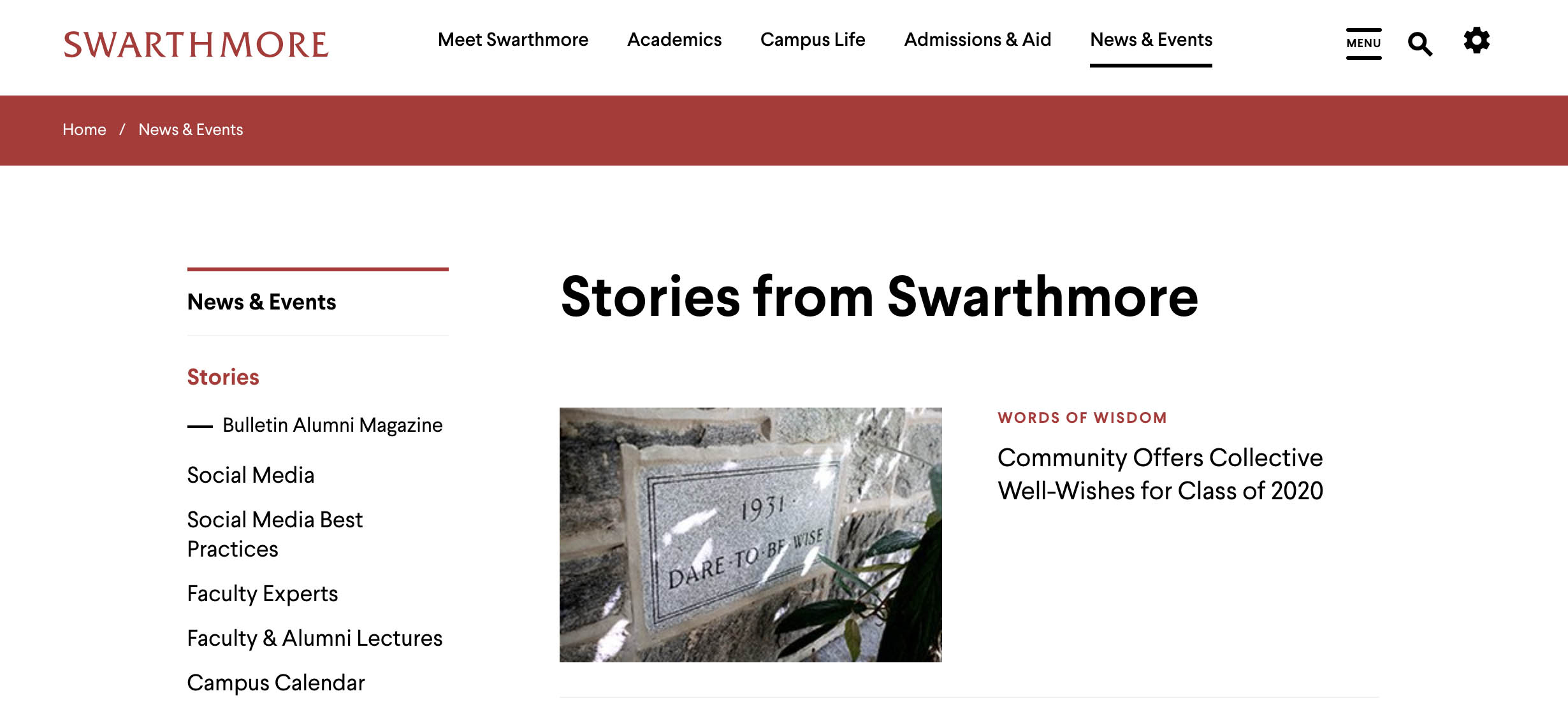
Recommended Sizes for News and Events Pages & Thumbnails
Image Type | Retina (WxH) | Standard (WxH) | Preferred Ratio | Preferred Orientation |
|---|---|---|---|---|
- | - | - | - | |
2880 x 1266 | 1440 x 633 | 16:9, 3:2 | landscape | |
News Feed Pane (Standard Thumbnail) | 560 x 320 | 280 x 160 | 16:9, 3:2 | landscape |
News Feed Pane (Featured Thumbnail) | 1760 x 960 | 880 x 480 | 16:9, 3:2 | landscape |
840 x 480 | 420 x 240 | 16:9, 3:2 | landscape | |
Events Feed Pane (Thumbnail) | 840 x 532 | 420 x 335 | 16:9, 3:2 | landscape |
Events Feed Pane (Full Page Listing) | 840 x 670 | 420 x 335 | 16:9, 3:1 | landscape |
Ways you can contact ITS or find information:
ITS Support Portal: https://support.swarthmore.edu
Email: support@swarthmore.edu
Phone: x4357 (HELP) or 610-328-8513
Check out our remote resources at https://swatkb.atlassian.net/wiki/spaces/remote/overview
Check our homepage at https://swarthmore.edu/its